

Web Design & Development Trends:Sping Edition
So much is changing in the world of web design and development every day — and it can be difficult to keep up. That’s why we’ve created our “Trends from The Web”: to cut through the noise and bring you the latest trends, stories and conversations about web design and development that you need to know.
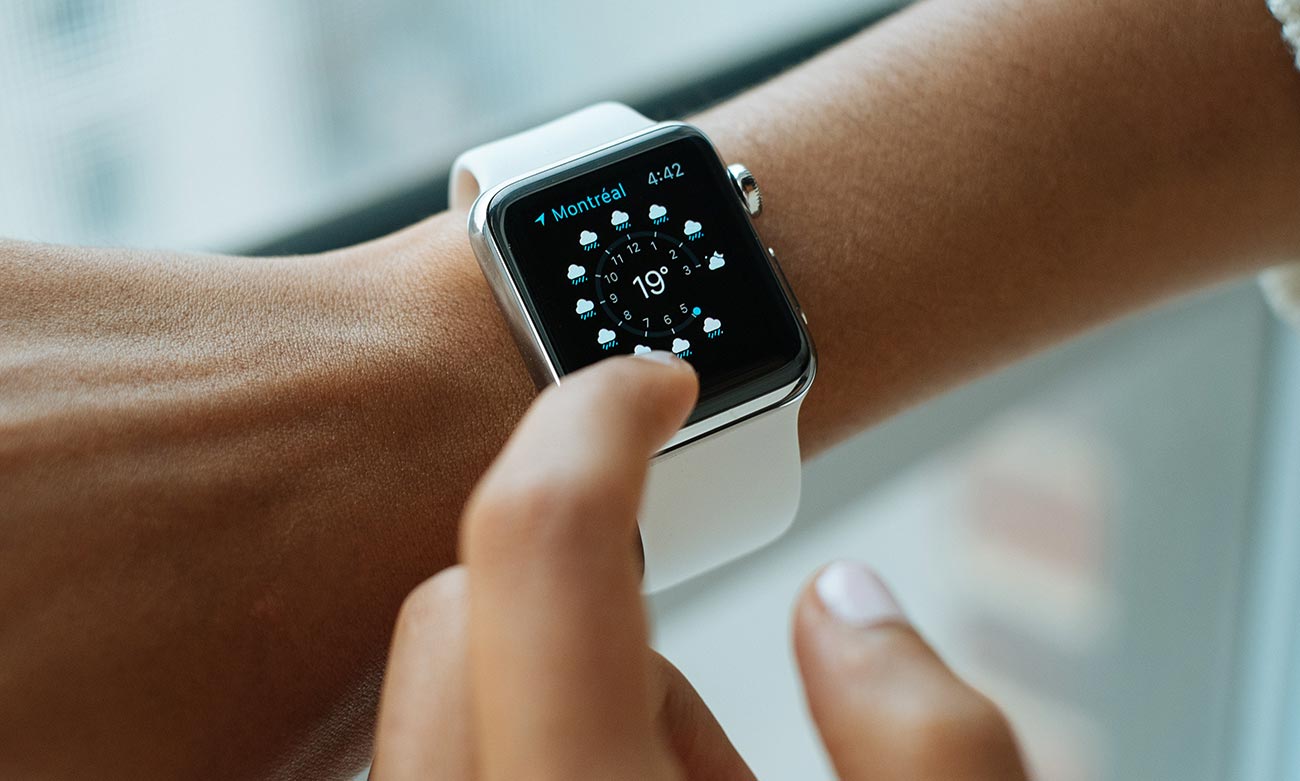
Float On

Floating field label interaction by Matt D Smith
There’s an interesting debate going on about floating field labels and their impact on the accessibility of online forms. In one corner is Adam Silver, who argues that the floating label pattern can be detrimental to a user’s ability to navigate and complete an online form. In the other is Matt D. Smith, the original designer of the floating label, who maintains that the floating label pattern can add enjoyment to the rather mundane process of completing an online form.
Our Take:
Both arguments are admittedly anecdotal, with little data to back up either position. Matt D. Smith does mention that one of his signup forms that contained floating labels converted much higher than average, but I would wager that this is due to targeting a niche audience and not an indicator of the performance of floating labels.
Ultimately, I believe a particular solution should cater to the intended audience. If you are targeting the bleeding-edge tech crowd – go nuts! These are your people and they will flip over anything new and shiny. If not, it’s better to err on the side of wider usability and display the form labels.
An Ad Too Far

Modal advertisement example from Nielsen’s survey
The Nielsen Norman Group recently published a study to determine the most hated online advertising techniques. Participants were asked to rate how much they disliked a particular ad on both desktop and mobile platforms, and the results probably won’t surprise you. Rounding out the top three most hated techniques are modal ads (also referred to as ‘pop over’ or ‘overlay’, depending on who you ask), ads that reorganize content as you scroll, and the dreaded auto-playing video.
Our Take:
These findings echo my own feelings on intrusive online advertising and the timing couldn’t be more perfect – Google announced a few days earlier that Chrome will begin blocking these types of ads.
Speaking of annoying advertising-based practices on the web: I’ve noticed that large online publications, such as Mashable, have started clipping stories on mobile devices with a ‘Continue Reading’ button. While not specifically an advertising technique, this practice is incredibly frustrating (especially since it’s triggered via JavaScript, usually after you’ve read past the clip point) and serves no discernible purpose for the user. According to Brad Frost, a user’s ‘willingness to be inconvenienced, interrupted, and insulted is dwindling’ and removing friction from an experience – either in the form of intrusive advertising or data collection practices — is key to retaining users.
Going Back to Memphis

Book on Memphis design
It’s said that styles tend to repeat every 30 years, meaning the 80’s are due for a comeback. One 80’s trend that is seeing a resurgence is the Memphis design movement. One of the most accessible examples of Memphis design is the MTV logo – bright colors and wild patterns assaulting the viewer after every commercial break. Originally meant as a rejection of the strict rules of modernism, we’re seeing the same rebellion play out on the web as young designers seek to push beyond the minimal, flat aesthetic that has permeated the digital landscape.
Our Take:
The case could also be made that this is simply a continuance, or even evolution, of the relatively recent brutalist redesigns – bloomberg.combeing a prime example. Sites like The Outline are fully embracing the aesthetics of Memphis design, proving that publications can be both serious and playful at the same time – they can report on compelling stories without relying on the traditional newspaper look and feel. This dichotomy allows them to connect with their millennial & Gen-Z skewing audience, and potentially steal valuable screen time from other less-formal entertainment and pop culture sites, like Reddit.
Rise of the Machines

Screenshot of Fontjoy.com
With artificial intelligence and machine learning permeating our everyday lives, it’s only natural that design-related tools follow suit. Fontjoy and Colormind are two recent examples that utilize machine learning to automate a historically human process, and the results are mixed.
While online font combination and color scheme generators are nothing new, they have typically utilized some sort of user input as a starting point: choose a primary color and receive a complimentary color set. In place of that process, these tools utilize custom algorithms to analyze large data sets – in this case vector paths and found imagery – and output mathematically harmonious combinations.
Our Take:
As exciting as these experiments are, I see them as another element in the design tool kit. The machines simply can’t consistently replicate the nuance of a talented designer – at least for the time being.
As you can see, there’s a great deal going on in the world of Web Design & Development. We hope you’ve enjoyed this Roundup and hope you’ll check back soon for our next blog post.
To have the latest industry news and alerts sent right to your inbox, please consider signing up for our newsletter. And if you have a web design or development challenge, feel free to contact us. We’re always happy to help!